Production Company Logo Identity

We created this logo using Adobe Photoshop and added light bulb themed shapes using the shapes tool found in Photoshop. We decided as a group to keep the logo very simple but effective and in relation to our Production Company video. We made the logo slightly different from the videos text so that we can use it on documents and other material, which means we don't have to use the Production Company video`s image as our logo which can look odd when being displayed as a still image.
We decided to do the colours as black and red, which gives the connotation of fear and danger that viewers can expect to be present in our final production. We added the font of slick and stylish to suggest to the public that our films are of a high standard and high finishing quality.
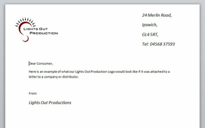
Here we have an example of what the Logo would look like if it was found on a document or piece of promotional material. (TC)
We decided to do the colours as black and red, which gives the connotation of fear and danger that viewers can expect to be present in our final production. We added the font of slick and stylish to suggest to the public that our films are of a high standard and high finishing quality.
Here we have an example of what the Logo would look like if it was found on a document or piece of promotional material. (TC)